Overview
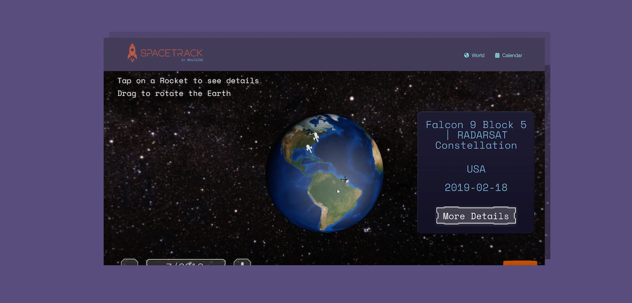
For the NASA Space Apps Challenge 2018 we created a web based application to track Space Launches on an interactive 3D globe as they happen to create an educational and fun way to make rocket launches more interactive.The Hackathon
As hullCSS, we went down to the C4DI on the waterfront at Hull to participate in the annual NASA Space Apps Challenge in the largest group in a hackathon we’ve taken part in as hullCSS before (and my first) - to try and create our best solution to NASA’s challenge.

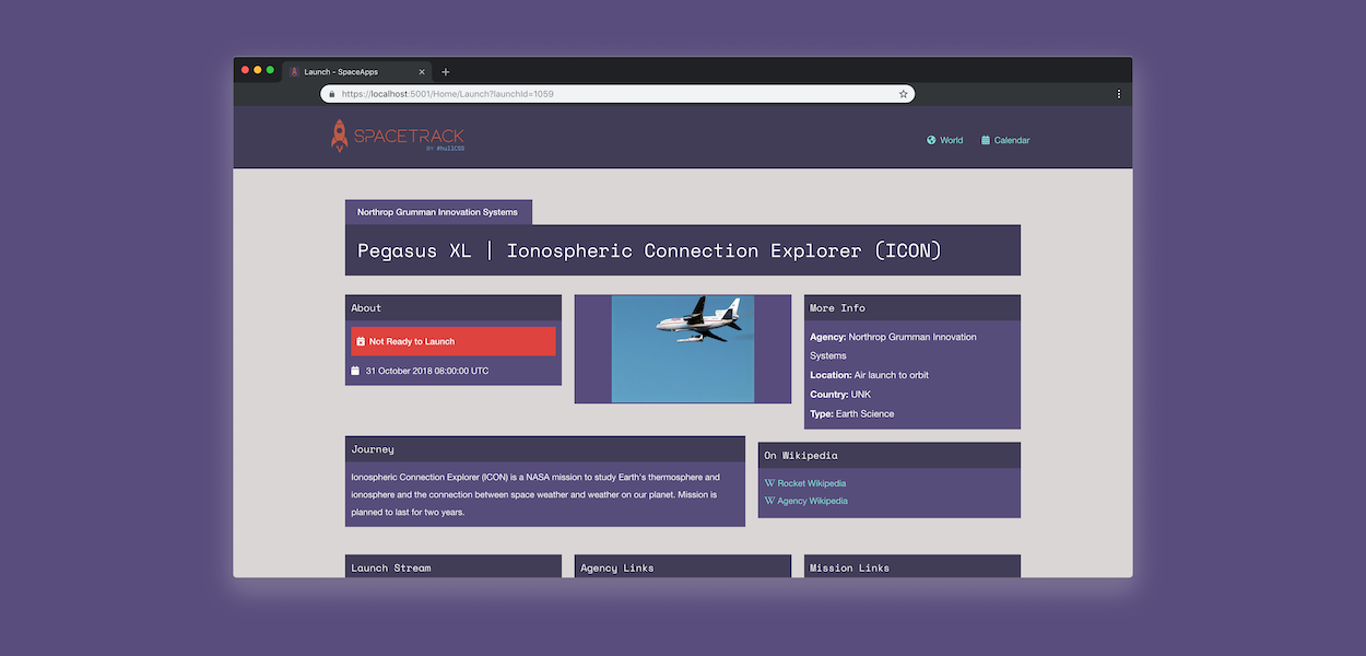
We used PlayCanvas (like Unity but JavaScript) for the interactive globe and a C# MVC 5 backend for the web server that scraped the data from Space Launch APIs and served them up through our application, with an API for both the calendar view (using JavaScript’s FullCalendar) and in a globe map view (fed into PlayCanvas).
I took the lead brand design, as well as getting the calendar data, processing it in the front-end and building the user interface.
Tools Used
- PlayCanvas for the game engine
- ASP.Net Core for the web application
- NASA Space Launch APIs as data source
The branding

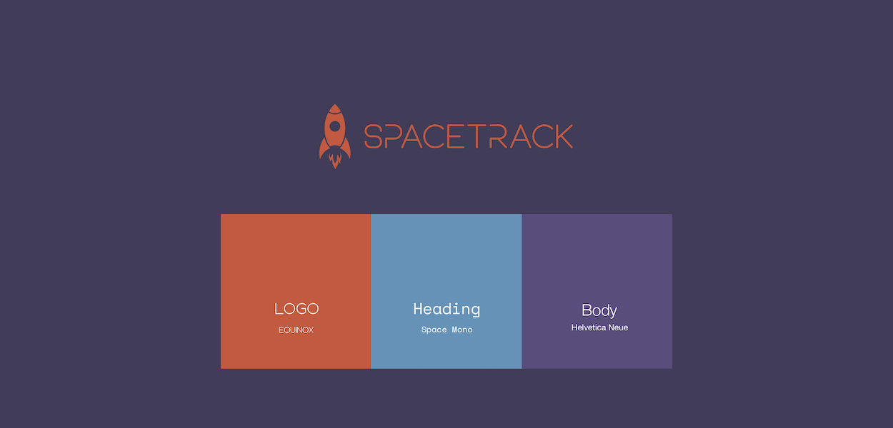
I also took the lead on brand design, wanting a bright futuristic look that stood out to the user. It needed to scale for the different platforms, becoming just a rocket when used on its own for favicons in the browser and in the VR icon.
The colour palette was chosen to stand out and be unique in representing the product we created, it had to be vibrant to appeal to children too, as our main aim was to create something that was cross platform that appealed to all ages.
We used three fonts, the logo using one that was futuristic but would not work well for normal text display for readability, a heading monospace font maintaining futuristic look but more simple and body font using just Helvetica.
Outcome

Overall I was really proud of the product we created in under 24 hours, we believe that we not only covered the problems brought up by the project specification, but more importantly we give users an engaging way to interact with space launches worldwide.
Our solution provided a variety of information about the launch, teaching people more about the rockets, companies and missions that go on all the time. It also gives a good view of timelines and can move along to see the rockets on the earth in an interactive view.
Video
SpaceTrack belongs to hullCSS - Hull Computer Science Society, it's an open souce project