Going to Monzo Show and Tell Manchester
This week I went along to my first Monzo event, Show and Tell Manchester. I’ve been meaning to go along to a Monzo event for a while but haven’t had chance as I’ve either been at University or they’ve been in London; I’ve been following Monzo from a while from getting a Beta card in 2017 and writing a blog post about building on their API, I’ve always found their modern tech-stack and community-driven approach really cool. The event was held in The Federation in Manchester, a pretty unassuming building from the outside but a modern co-working space inside.
I wasn’t sure what to expect, going from super quiet when I arrived to completely packed in a matter of minutes - it’s amazing how a bank of all institutions can grab so much attention from the mix of engineers, business people, managers and customers in the audience. After a bit of time to chat with other people in the audience as well as free pizza and beer (always a good perk), we got going and heard from the developers.
Billing Pots
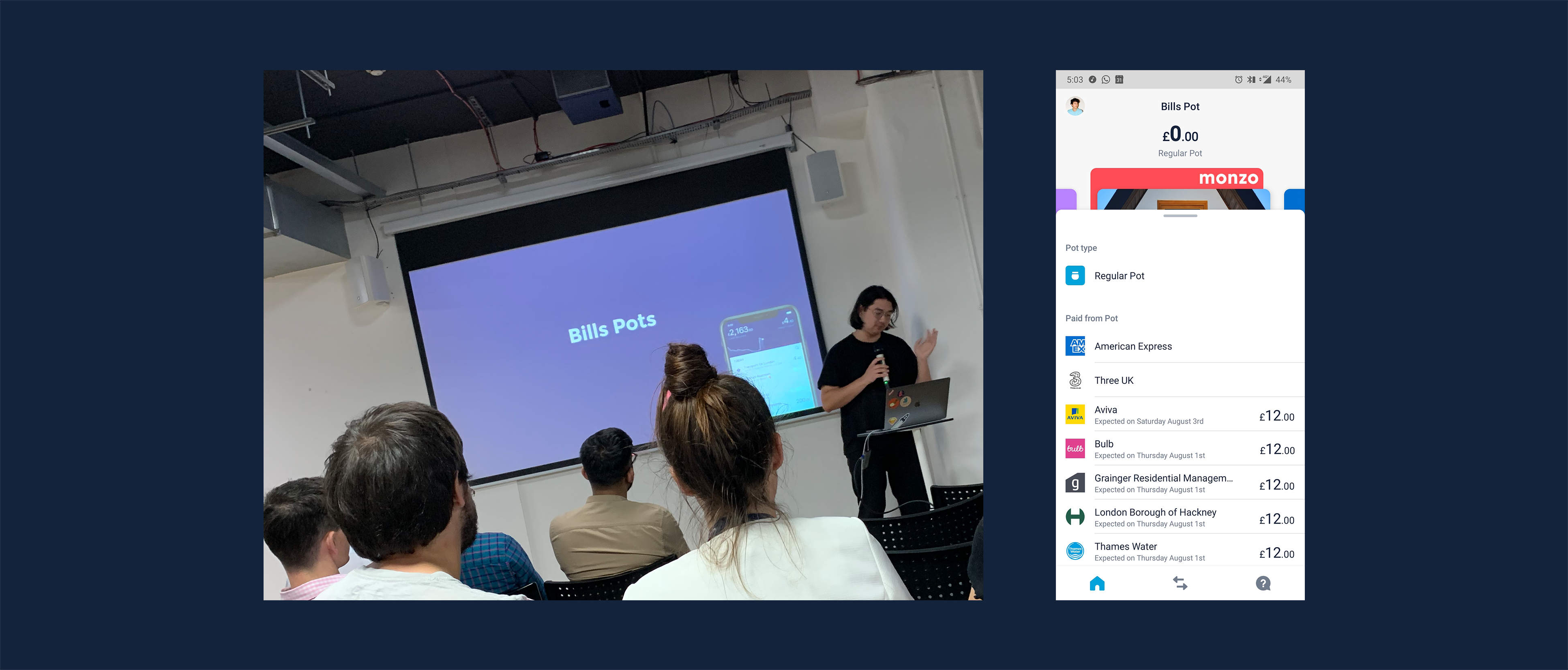
First up we heard from James, a backend engineer at Monzo who spoke about the latest development, based around the goal of getting more people to use their account as their main one which is billing pots and get paid early.
Billing pots were designed around the idea that people like to segment their money, so you can go on a night out and not spend every last penny! We heard about how their MVP model with constant evolution led to the current implementation (where the money is moved back into primary account just before the payment is taken at around 3 am). The community-driven aspect was really clear on this as their previous model of committed spending pots (pots for all direct debits) was seen as confusing, so with customer feedback, it could be refined before it even got released.
There were then questions about what classes as a bill, would a recurring payment (i.e. Netflix or Spotify) fall into those categories, and how could that be paid from a pot - but we’ll come back to that later.
It seems that now is a really interesting point at the bank’s history, as the assumptions made 4 years ago in the early code are starting to break, as users aren’t single entities with a couple of pots anymore with joint, business and investment accounts launching alongside. To be able to manage this, a clearer and simpler design system was needed for the app.
New Navigation
Kavi then came on to explain this process, talking about the new app design what went into building a new and simpler experience, that could be both easily understood by customers (around 2.5 million now) and easily added to by the growing development squads (15 product teams).
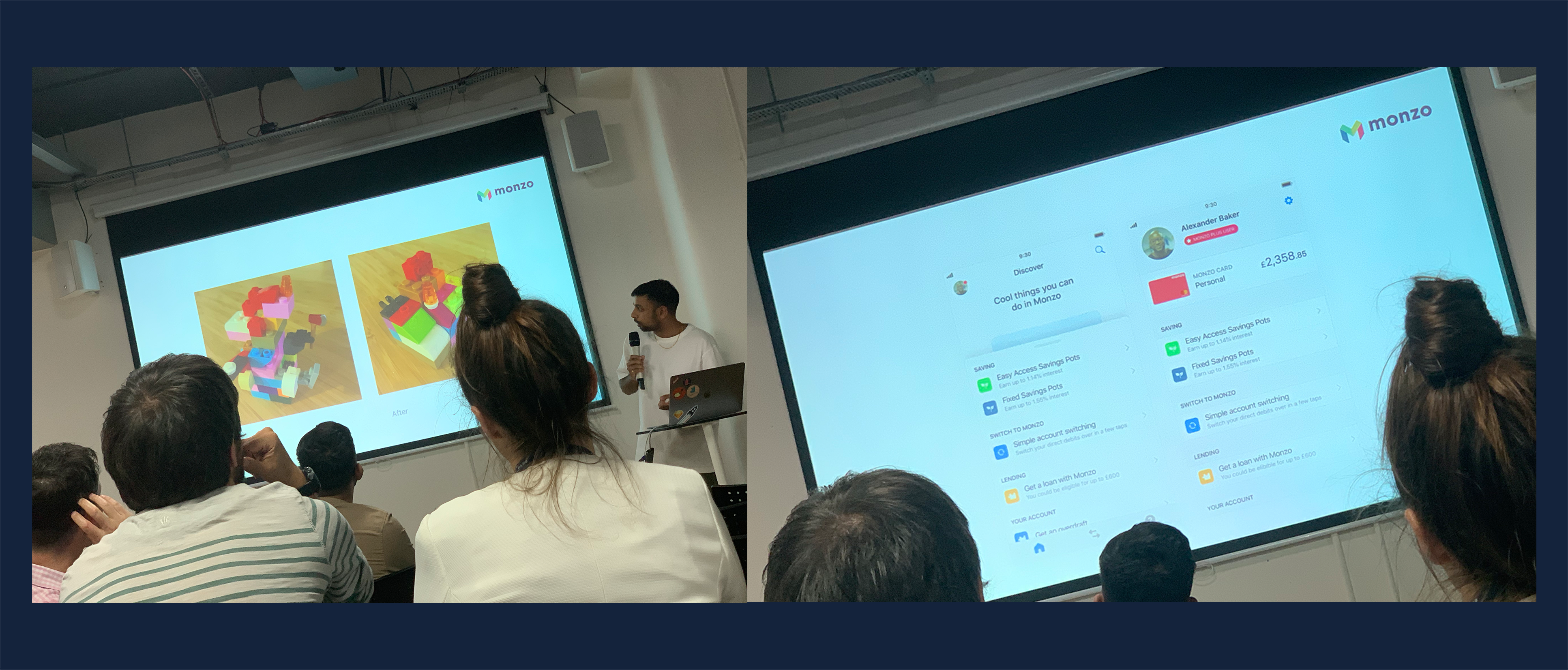
The current app was compared to the lego you can see in the picture of the above, with the features there but bolted on in an unordered way and the new design being is a way to give a better structure, to make customers discover the things that make them love Monzo as fast as possible.
The new tabs in the top bar are as part of a view to make the app the home of your financial life, where you can overview all of your bank accounts at a top-level by just swiping through (like a photo album) and then be able to work down granularly into the details of all your accounts (like a photo).
The first step in this is Amex, but over time it’s looking to be extended especially with the launch of open banking (see previous blog post here) and the tabs are also going to be made the place to make you aware of new services that are available, instead of being shown as feed items.
Pots, with cards?
James mentioned the possibility of paying for recurring payments using pots, but the current method for Direct Debits of automatically checking, then transferring the money from the pot into the balance not being good enough for this. MasterCard requires a response in less than 200ms to tell them whether the customer has sufficient balance before they reject on the bank’s behalf, not giving enough time for two lookups.
He mentioned that virtual cards could potentially be a solution to this, but that made me think how could that practically be implemented.
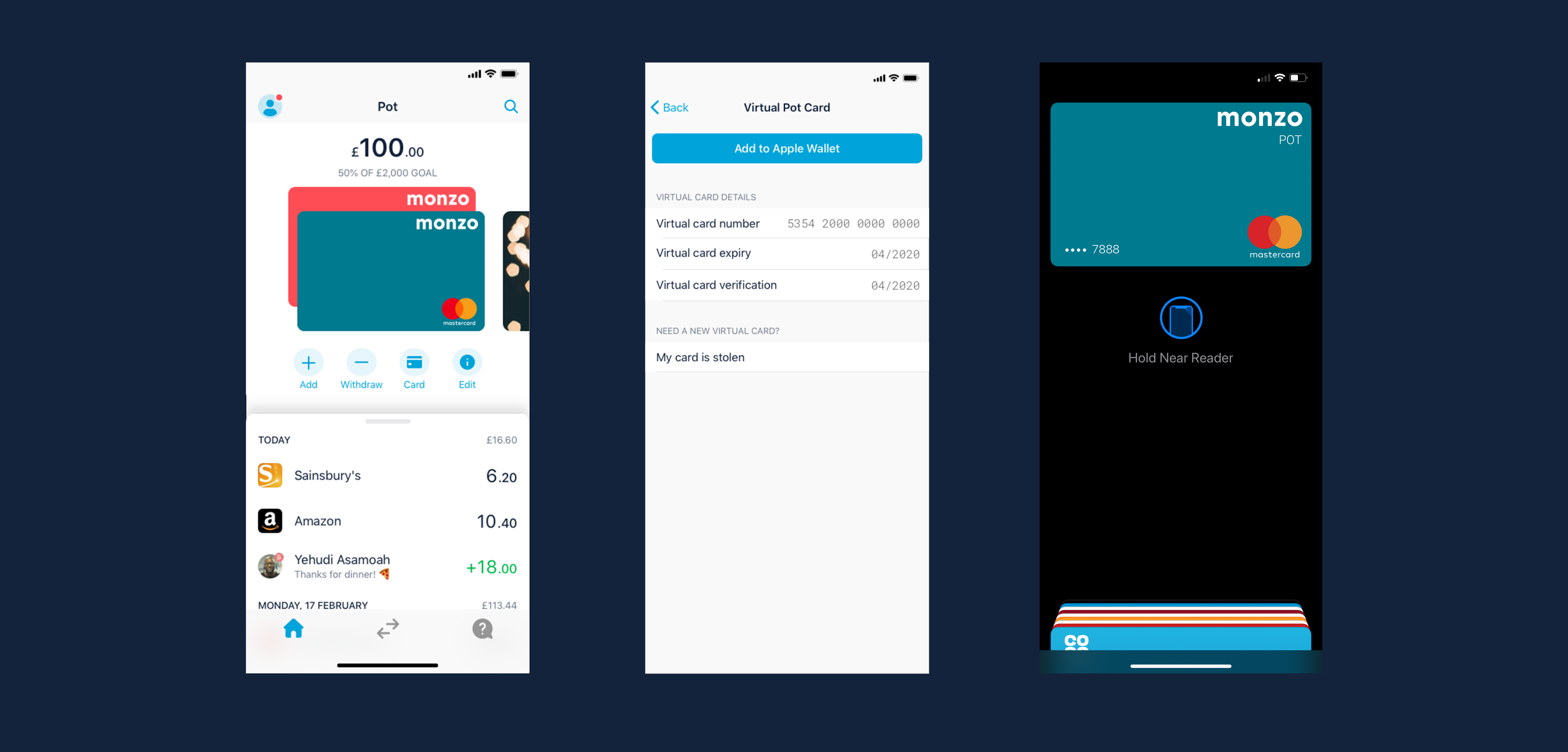
Based on the assumption that for virtual cards, MasterCard’s Digital Enablement Service (the thing that makes the card’s virtual numbers used in mobile wallets) asks the bank for an image of the card (which would make sense due to investor & joint account cards showing differently but having the same BIN), a different image for the card can be generated based off pot colour and shown in the mobile wallet to allow the card to be shown separately and allowing only one card of each pot colour to stop getting mixed up.
You can see above a few mockups I made of how this could appear in-app (using their open UI kit on their GitHub); apparently implementing this isn’t on their short term road-map, however I think it would be a great way to handle it, especially as it’ll both remove the race condition for balance lookup, and allow people to segment their spending more easily.
Wrapping up
Thanks to the Monzo for running the event, especially Yen (Community Manager) and James and Kavi for speaking. It was interesting to hear how more about how Monzo does development. If there’s another event happening around you in future, I highly recommend going along to it!
Thanks to Monzo for putting their Sketch files on GitHub, it made doing quick prototyping easy.


